make your own mockups
June 21, 2021
Mockups are an amazing way to show your artwork in the context of a space, making it easier for your audience to picture your pieces in their own home. There are plenty of ways to buy mockup bundles (hint: we'll offer one at the end of this blog post), but it's a great skill to learn how to make your own, too – especially if you have an eye for photography. In this post, we'll walk you through how we turned our shots from Hope's photoshoot into Photoshop mockups for our spring line of fine art prints.
Mockup def'n: mockups are reusable photos with smart layers that allow you to drag and drop different designs – a hugely valuable tool for social media and website assets. This post focuses on mockups for art prints in Photoshop.
Step 1: Take the right photo
First thing's first – set the scene. Pick a frame you'd like to use. We recommend removing the glass from the front of the frame and shooting with a white piece of paper in the frame to make it easier to capture and replicate the shadows of the room (note: we won't be going over shadow replication in this tutorial, but there are some great youtube videos on that topic). You can see in our picture that we took out the glass but left cardboard behind – that worked for us in this case because we didn't have any significant shadows we were trying to capture. We suggest picking lighting that does not create harsh shadows if this is your first rodeo creating mockups. It will save you a lot of time in the long run from having to recreate/preserve those shadows on your mockup.
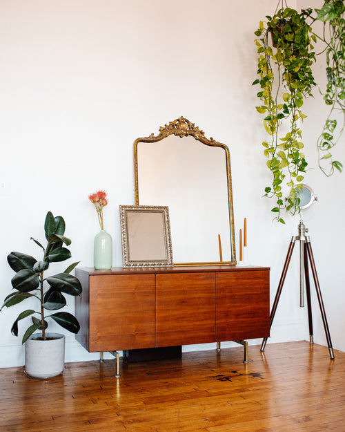
Add little elements to your scene to make it feel more homey and less staged – like a vase of flowers or a little candle. We won't go into great depth about camera settings and applying filters in this post (that might come a little later 🙂). Upload your photo and apply any filters or color editing you want in your photo editing tool of choice (we use Lightroom). Export the photo as a high resolution JPG file.
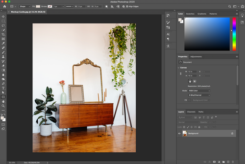
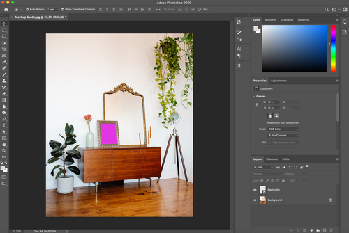
Step 2: Set up your Photoshop file
Open your JPG file in Photoshop ("File" > "Open"). Your file will automatically load as the Background layer for your Photoshop document.
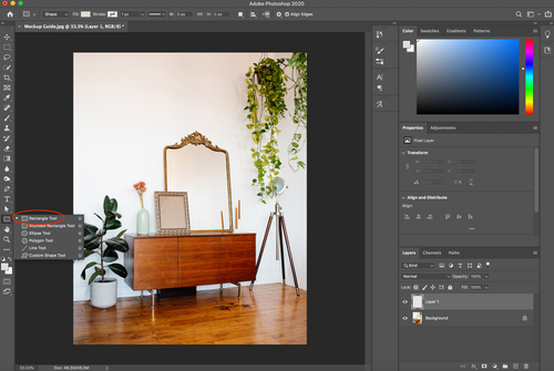
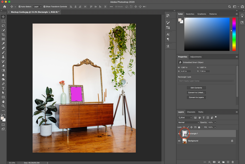
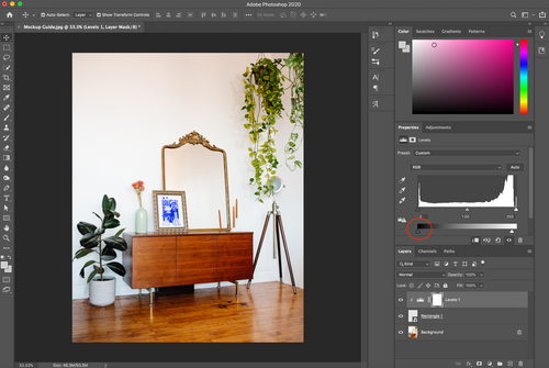
Step 3: Start making your mockup "zone"
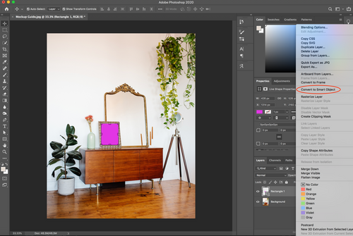
Next, you'll want to start outlining the area within the frame that you'd like to turn into an editable mockup. To start, create a new Layer using the plus symbol in the bottom righthand corner of your Photoshop window.
Use the rectangle tool to create a rectangle that is roughly the same size as the interior of the frame. This doesn't need to be an exact match – especially if there is any perspective in your shot, then the corners will definitely not line up. And that's okay! You're doing it right. I recommend filling the rectangle with a color that makes it easy to see. We used pink. (Tip: in the "Properties" panel, you can change the interior color of the rectangle by double clicking on the box that says "set shape fill type" when you hover over it).
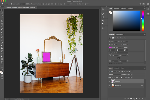
Right-click on the layer that contains your new rectangle and select "Convert to Smart Object." This will turn your rectangle into an editable object where you can drop in your art files later on. But first we need to fix the perspective and fit the rectangle into your frame.
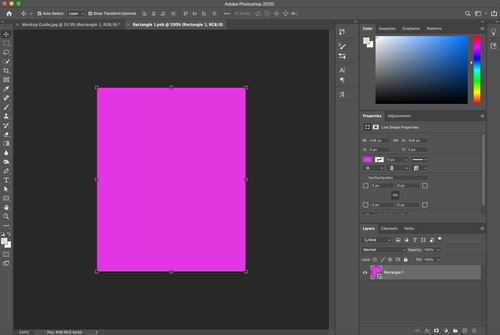
Step 4: Perfecting your mock
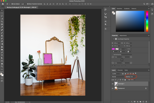
Set your "Opacity" for your rectangle layer to 60%. This will help you better see the edges of the frame and where your rectangle currently overlaps.
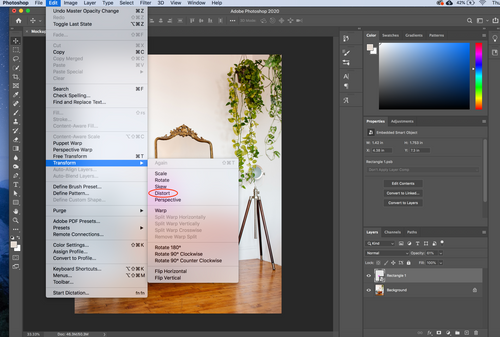
Next, go to "Edit" > "Transform Path" > "Distort." We are now going to perfectly fit your rectangle into your frame. You can now drag the corners of your rectangle to exactly match the interior corners of your frame until there is no overlap. Tip: I used the shortcut "command +" to zoom in and get a closer look at this part.
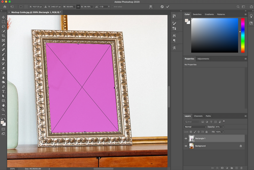
Once you've completed this step, you can turn the opacity of the rectangle back to 100%. (And use the shortcut "command -" to zoom back out).
Step 5: Test it out
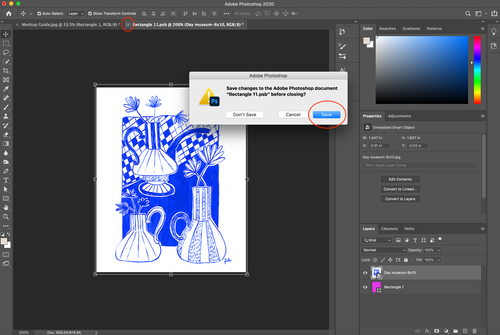
Now it's time to put in one of your art files and see how it looks. We won't go through the process of turning your physical art into digital files in this blog post (that's for another time!) but you'll want to make sure your digital file with your art piece is high resolution. Double click on the layer with your rectangle – make sure you double click on the image preview part of the layer bar, not the grey part of the layer bar.
Another window will open for you that is just your rectangle Smart Object. You can now drag and drop your art file into this window. Increase the size of your art file so that it goes to the edge of the rectangle Smart Object.
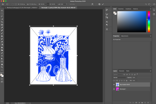
When it looks good to you, you need to hit "return" to officially place the file. You then can "X" out of this file and click "save" when prompted.
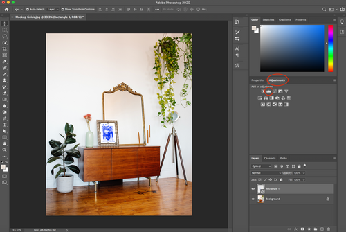
You'll now see your art print in your frame! But you may notice the lighting looks a little off from the rest of your photo, depending on how much editing you did to the original. That's totally fine – we can help with that!

Step 6: Perfect the lighting
The main thing you'll want to adjust to make sure your art print "fits in" with the rest of your room is the lighting – the brights and darks. Go to "Adjustments" > "Levels"
You'll notice a new layer was created with the name "Levels." Before you make any adjustments, you want to make sure that only the layer with your art file will be impacted (rather than editing the lighting for the whole shot). To do that, right-click on the "levels" layer and select "Create Clipping mask." Any edits you make will now only impact the layer right below – your smart object layer.
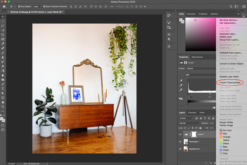
Now go to the "levels" box and adjust the arrow on the white side of the bar. You'll notice that if you pull the arrow to the left, the whole art piece will get darker. You are adjusting the highlights of the art piece. Start by adjusting until the lightness of the art piece seems to match the lightness of the rest of the scene.
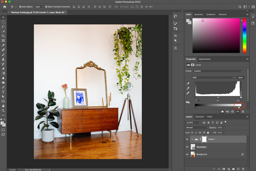
Now you can do the same with the arrow on the left on the darker part of the bar – the shadows. Play with the adjustment of the shadows until the art piece looks just right in your frame. We often don't need to adjust the shadows and primarily adjust the highlights (the white part of the bar).
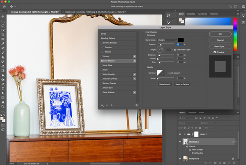
One last touch – let's add some small shadows to show depth. Double click on the rectangle layer (the grey part of the bar this time, not the image preview) and select "Inner Shadow".
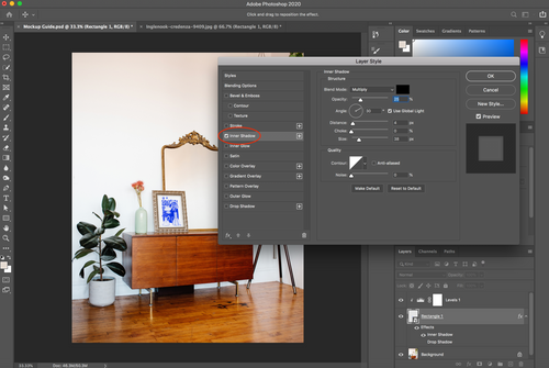
This will apply a shadow to the interior border of your art print, making the appearance of a shadow from the outer frame. You'll need to play a bit to make the shadows look soft and realistic instead of harsh. Always make sure the "Blend Mode" is set to "Multiply." You can play with the "Angle" of the shadow to try to make it match the angles of the rest of the shadows in your shot. The main settings you'll play with are "Opacity", "Distance", and "Size" – we rarely touch the other settings. Depending on how big your frame is and the setting of your room, each photo will need its own unique combination of these factors. For this photo we used these parameters:
That should do it! You're ready to export your file ("file" > "export" > "export as" > we typically choose "JPG").

There are a whole host of other things you can do to keep fine tuning the appearance of your art print in your frame, like applying shadows from the original photo or adjusting the color filtering. We'll have to get to those next time! Meanwhile, if all of this bores you or is quite simply overwhelming, we got you – you can purchase a bundle of our own mockups here: